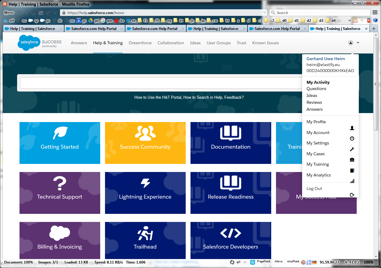
Today I noticed a change in the Help&Training section. Last Friday (2015-10-23) it was more Aloha now it looks more Lightning.
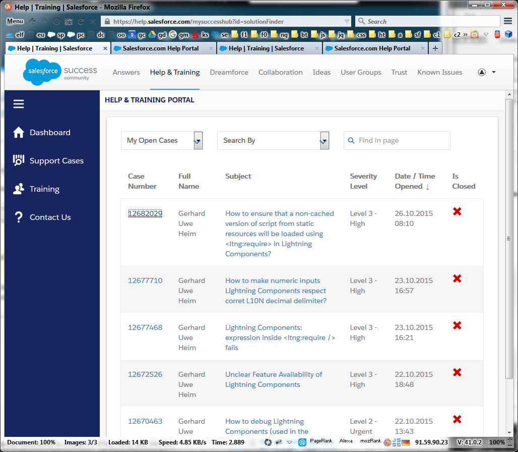
But... the clickpath to the cases list is very long and time consuming. It wasn't straight-forward earlier, but it became way worse now. I want to go straight here:
As an unfortunate using a bookmark on https://help.salesforce.com/mysuccesshub?id=solutionFinder pipes me again to multiple clicktrough-pages and cost me time, even if I'm logged in already.
Extension 1
Additionally last Friday (2015-10-23) I had a "Clone" Button on the case-detail view. Now this is gone... The clone-button was very useful, since I have to log a lot of Cases for premier support (about Lightning Development, Bugs, etc.) and to fill out the long list is unnecessarily time consuming, because I use always the same Sandbox, OrgId, Browser, Browser-Version and I have provided login access...
Extension 2
It became very uncomfortable to log new cases, too. Before that "update" there was a "New Case" Button, which is gone! Now it looks like we have to click through the "Contact Us" in the right sidebar. Not nice...
Extension 3
Browser's forward/backward-navigation seems broken. You can't get reliably back and ahead, instead it will jump to an unintended page. Very frustrating...
Extension 4
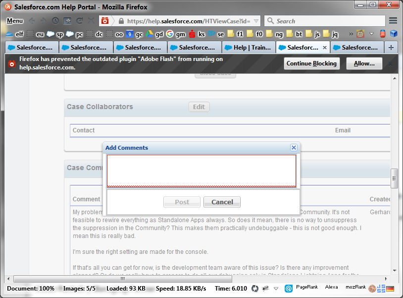
I have to funnel all my texts (which are considerably long) into such a tiny little popup. This is very hard to use:

Conclusion
Right now my case input- and management-time feels quadrupled - at least.
What am I doing wrong? How can I use the new interface so that it saves time instead of cost more time? I'm sure that I'm missing something.
Sidenote: I think the reason behind some of these issues is the Lightning way of navigation done by Javascript and events... It looks like it comes at the cost that you loose a lot of good basic browser features at this time.


