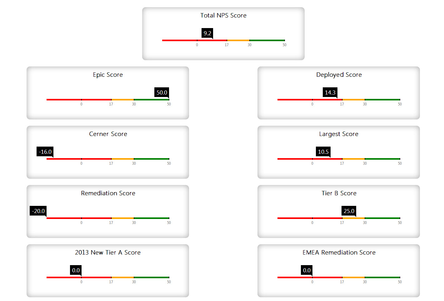
I have a batch job that runs twice a month to calculate a score. I dump the data into a custom object called CA_NPS_Score__c. Each record just contains A few decimal fields, and a formula field that calculates the NPS Score. I have to do this in a batch job because the calculations done to get the decimal fields are too complex to do in a formula field.
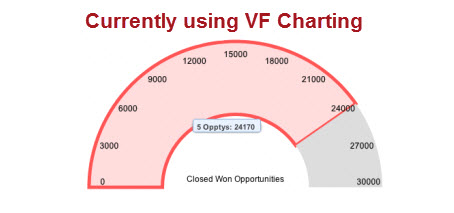
I was fairly easily able to plot these scores into line graphs using VF charting to show the changes over time. Now my clients would like to have a simple gauge to show the score. These seem simple enough as well, but I am unable to get the gauge to look similar to the normal dashboard gauge. The gauge I created looks similar to the the gauge in this blog post
http://blogs.developerforce.com/developer-relations/2012/10/animated-visualforce-charts.html
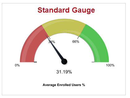
The issue is I would like it to look more like the standard gauge dashboard component, mainly to be able to have 2 breakpoints, so I can show my low, medium, and high ranges graphically within the gauge. I have tried overlaying a second and third gauge on top of the gauge to show the different sections. I tried carrying the values of the breakpoints in the wrapper class, but I don't know how to show them visually on the VF page. There doesn't seem to be a way to show anything but the actual value on the gauge.
Is this possible?? Is there another way to accomplish this? I can't imagine I am the only person that has ever needed to create a gauge with breakpoints using VF. I can't help but thinking I am missing something very obvious and easy. Has anyone accomplished this?
Here is a very simple page and controller below:
VF
<apex:page controller="TestPageController">

<script>
    MyChart1.on('beforeconfig', function(config) {
        config.axes[0].margin=-10;
    });
</script>

   <apex:chart name="MyChart1" height="300" width="450" animate="true" data="{!data}">
       <apex:axis type="Gauge" position="gauge" title="Total NPS Score"  minimum="0" maximum="45" steps="10"/>
       <apex:gaugeSeries dataField="score" donut="50" colorSet="#00F,#0F0" needle="true"/>
   </apex:chart>
</apex:page>
Controller
public class TestPageController {

    public TestPageController(){

    }

    public List<gaugeData> getData() {
        double NPS_score = 0;
        CA_NPS_Score__c score = [Select Id, Name, Total_NPS_Score__c, Most_Current__c  From CA_NPS_Score__c Where Most_Current__c = true];

        List<gaugeData> data = new List<gaugeData>();
        data.add(new gaugeData('NPS', score.Total_NPS_Score__c));
        return data;
    }
    public class gaugeData {
        public String name { get; set; }
        public decimal score { get; set; }
        public decimal lowRange { get; set; }
        public decimal highRange { get; set; }

        public gaugeData(String name, decimal npsScore) {
            this.name = name;
            this.lowRange = 17;
            this.highRange = 30;
            this.score = npsScore;
        }
    }
}
Here are some Visuals of what I am talking about:


