18

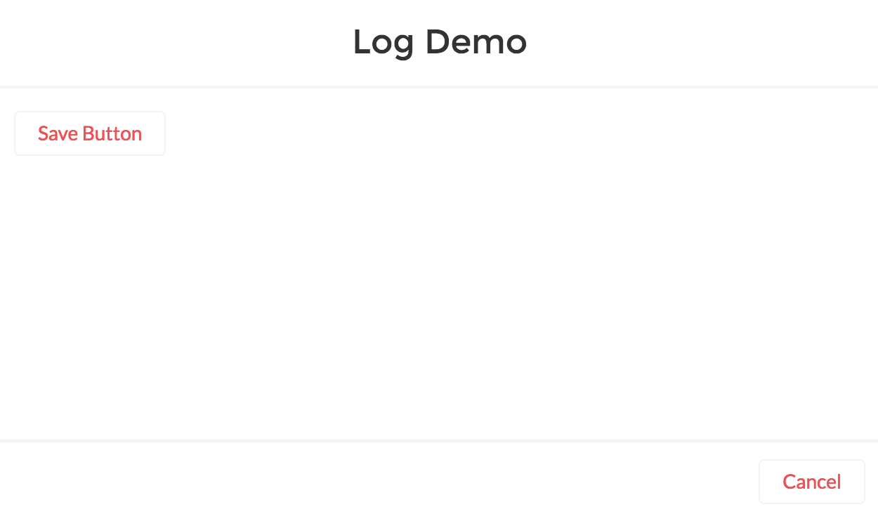
Can you add an additional footer button next to Cancel for a Lightning Quick Action?

<aura:component implements="force:lightningQuickAction">
    <ui:button label="Save Button" />
</aura:component>

I'm aware that I can use force:lightningQuickActionWithoutHeader and customize the whole design. Just wondering in the Lightning System provides a built in way of doing this.

<aura:component implements="force:lightningQuickActionWithoutHeader">
    <ui:button label="Save Button" />
    <ui:button label="Cancel Button" />
</aura:component>

Lightning Quick Action Modal

5 Answers 5

25

I'm afraid you can't. I would like to be able to do it to, at least customize the behavior of the "Save" button, but unfortunately it's not possible.

As you said, you need either to put the button inside your component with force:lightningQuickAction, or recreate everything in a component with force:lightningQuickActionWithoutHeader. Solution 1 is easier but not good looking and not consistent with the standard UI, but solution 2 needs more work.

You can use Salesforce Lightning Design System modal as a starting point for solution 2, but bear in mind that the look & feel is different in Salesforce1, if you use it.

Also, you can create a Idea for that and post the link here, I would be the first one to vote for it.

Last point, if you have access to the Partner Community, I asked the question here so I guess you can add your own comment to the thread to show the PMs I'm not the only one interested.

1
  • Would you mind sharing you code to get it done using force:lightningQuickActionWithoutHeader? Commented May 23, 2017 at 20:58
5

I managed to fix it myself. This solution override the dialog box height which you mentioned while creating custom action on an object. I hope this will help someone needed.

<aura:component implements="force:lightningQuickActionWithoutHeader,force:hasRecordId" controller="MilindTest">     
<style>
    .cuf-content {
    padding: 0 0rem !important;
    }
    .slds-p-around--medium {
    padding: 0rem !important;
    }
    .slds-modal__content {
    overflow-y: hidden !important;
    height: unset !important;
    max-height: unset !important;
    }        
</style>

<div class="slds-col modal-header slds-modal__header">
    <h2 class="title slds-text-heading--medium">Milind Test</h2>
</div>
<div class="slds-col modal-body scrollable slds-p-around--medium" style="height: 200px; max-height: 400px; overflow-y: auto !important">
    <div>
        <p>&nbsp;</p>
        <p>&nbsp;</p>
        <p>&nbsp;</p>
        <p>&nbsp;</p>
        <p>&nbsp;</p>
        <p>&nbsp;</p>
        <p>&nbsp;</p>
        <p>&nbsp;</p>
        <p>&nbsp;</p>
        <p>&nbsp;</p>
        <p>&nbsp;</p>
    </div>
</div>
<div class="slds-col modal-footer slds-modal__footer">        
    <lightning:button variant="neutral" label="Cancel" onclick="{! c.cancelClick }" />      
    <lightning:button variant="brand" label="Save" onclick="{! c.saveClick }" />
</div>

</aura:component>

3
  • 2
    No feasible anymore with api >= 42.0. CSS styles within cmps are disallowed by now. Commented May 11, 2018 at 12:13
  • 4
    You can add style directly with api >= 42.0 by using <aura:html tag="style">your_css_contents</aura:html>! Commented Dec 17, 2018 at 18:46
  • 1
    I did this the way Jon mentions successfully. Still annoying, as we move forward with lwc it seems there are lots of little problems similar to this. Commented Jan 16, 2020 at 19:50
1

My solution was:

<aura:component implements="force:lightningQuickActionWithoutHeader">
    <footer>
        <div class="modal-footer slds-modal__footer attach-to-bottom">
            <button class="slds-button slds-button_neutral">Cancel</button>
            <button class="slds-button slds-button_brand">Save</button>
        </div>
    </footer>
</aura:component>

CSS
.THIS .attach-to-bottom{
    position: absolute;
    bottom: 0px;
    right: 0px;
    width: 100%;
}

Hope it helps.

0

Duplicate to this: how to access the save button in a modal when implementing the force:lightningQuickAction

And an idea was created here: https://success.salesforce.com/ideaView?id=0873A000000cNRIQA2

0
0

I basically use sticky css on the footer making sure the footer element is with the modal content, which is the complete modal content for a force:lightningQuickActionWithoutHeader

With this, the footer will always be sticky to the bottom of the body and the all the content in Body1 div will be scrollable and will scroll under the footer.

<aura:component implements="force:lightningQuickActionWithoutHeader">
    <aura:html tag="style">
        .slds-modal__container{
        max-width: 70rem !important;
        width:70% !important;
        }
        .slds-modal__container .cuf-content {
        padding:0 !important;
        }
        .slds-modal__container .slds-p-around--medium {
        padding: 0rem !important;
        }
        .slds-modal__content {
        height: unset !important;
        max-height: unset !important;
        border-bottom-left-radius: unset !important;
        border-bottom-right-radius: unset !important;
        }
    </aura:html>
    <div style="height:40rem;max-height:40rem>
       <div>Body1</div>
       <footer class="slds-modal__footer">FooterBody</footer>
    </div>
</aura:component>

Custom CSS for Footer:

footer {
    position:stikcy,
    bottom:0,
    z-index:2
}

You must log in to answer this question.

Not the answer you're looking for? Browse other questions tagged .