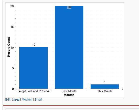
I have an requirement where I want an chart(Bar chart) report where it shows logged in user's All Open Cases, Last Month Case and This Month cases are 3 Bar on X axis and Total Number of Cases on Y axis.
What I have tried I have created 3 Formula field All Open Cases, Last Month Cases and This Month cases. I have created an Summarized report with all the above formula fields.
Whenever I am adding an chart to my report it will ask X axis value and Y axis value. But I have getting only 1 options. for X axis it is only showing Record count and Y axis as One of the formula field by which I have summarized.
So it is only showing as grouped by only one type. I want 3 different bars with each value. All Open Cases, Last Month and This Month.
Please let me know if any more details are required from my side or any clarification.
Thanks In Advance.

