12

I'm desperately trying to display a modal in Salesforce1, but can't make it work. My component display information that doesn't fit on one screen so I need to scroll. Problem is that SLDS Modal will show up in the middle of my whole page instead of the middle of the currently displayed screen. So depending on where the user currently is on the page, he may not see the modal and need to scroll.

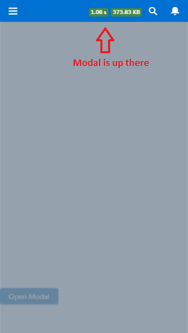
Here you can see that while being at the bottom of the page, I can't see the modal which is in the middle of the screen (so the only way to see it is to scroll up, at least if the user understand that there is something to see somewhere!):

SF1

As displayed here, Lightning Design System's modal isn't working because of a Salesforce1 bug.

Also, from what I understand from here, this is because SF1 is using a custom JS scrolling feature instead of standard web browsers one, and this breaks everything I tried in Salesforce1:

  • I tried to use CSS "position: fixed;" but this doesn't work
  • I tried to use JS "pageY" to get the clicked position and display the modal right there, but pageY returns an incorrect value in SF1
  • I tried to display the modal at the very top of the page and use JS "scrollTop" doesn't work

So I don't know how to display a modal in the center of the user screen, or even make some dirty workaround work like display the modal at the top and scroll to it.

Here is the code of a sample component that has the issue:

Component

<aura:attribute name="displayModal" type="Boolean" default="false"/>

<div style="height:1500px"></div>

<button class="slds-button slds-button--brand" type="button" onclick="{!c.showModal}" id="test">Open Modal</button>

<aura:if isTrue="{!v.displayModal}">
    <div>
        <div aria-hidden="false" role="dialog" class="slds-modal slds-fade-in-open">
            <div class="slds-modal__container" role="document" tabindex="0">
                <div class="slds-modal__menu">
                    <button class="slds-button slds-button--neutral" onclick="{!c.hideModal}">Upload from Device</button>
                    <button class="slds-button slds-button--neutral" onclick="{!c.hideModal}">Select a Salesforce File</button>
                    <button class="slds-button slds-button--neutral" onclick="{!c.hideModal}">Cancel</button>
                </div>
            </div>
        </div>
        <div class="slds-backdrop slds-backdrop--open"></div>
    </div>
</aura:if>

Controller

showModal : function(component, event, helper) {
    component.set('v.displayModal', true);
},
hideModal : function(component, event, helper) {
    component.set('v.displayModal', false);
}

Any idea ?

4
  • Hi Fabien, did you ever come across a solution to this? I have the same issue and it is frustrating.
    – Angelo
    Commented Jan 17, 2017 at 17:17
  • I'm afraid not. Commented Jan 17, 2017 at 17:26
  • Hi @FabienTaillon did you get any solution for this? Commented Feb 27, 2017 at 10:54
  • Not yet, couldn't do what I want with the answers below. Commented Feb 27, 2017 at 18:04

3 Answers 3

4

I had a similar issue and used some custom CSS to get the component to behave:

Modal.css

.THIS .slds-modal__container {
   height: initial !important;
}

Modal.cmp

  <!-- Markup -->
  <div class="slds">
    <div aura:id="theModal" class="slds-modal slds-modal--prompt" aria-hidden="false" role="dialog">
      <div class="slds-modal__container slds-modal--prompt">
        <div class="slds-modal__header slds-theme--error slds-theme--alert-texture">
          <h2 class="slds-text-heading--medium">{!v.header}</h2>
        </div>
        <div class="slds-modal__content slds-p-around--medium">
          <div>
            <p>{!v.message}</p>
          </div>
        </div>
        <div class="slds-modal__footer slds-theme--default">
          <ui:button aura:id="buttonOkay" class="slds-button slds-button--neutral" label="Okay" press="{!c.close}"></ui:button>
        </div>
      </div>
    </div>
    <div aura:id="theModalBackdrop" class="slds-backdrop"></div>
  </div>
3
  • Thanks but when I try this, I have my modal appearing at the top of the page. So if I have my button at the very bottom, users won't see it unless they scroll a few screens to go to the top... And I couldn't find a way to scroll automatically to the top as my attempts with scrollTop for instance didn't work.. Commented Jul 12, 2016 at 21:08
  • Yes, my solution sticks the modal to the top of the screen, so if you have a long page, it won't be of help. I don't have any other suggestions off the top of my head.
    – Isaac
    Commented Jul 12, 2016 at 21:10
  • Yes I've tried this before, but I couldn't scroll automatically to the top because I couldn't make it work too. That would have been dirty, but better than not seeing the modal at all if the page is too long. I've added some additional comments, picture and code sample to make it more clear to understand :) Thanks for your proposal though. Commented Jul 13, 2016 at 17:04
0

I've looked at you code and think there's a few things you can do that may be helpful to you. Let's remove the div with the 1500 px height that isn't wrapping anything and add some attributes.

<aura:attribute name="closeLabel" type="String" default="Close"/>
<aura:attribute name="cancelLabel" type="String" default="Cancel"/>
<aura:attribute name="confirmLabel" type="String" default="OK"/>

<aura:attribute name="onclose" type="Aura.Action" default="{!c.defaultCloseAction}"/>
<aura:attribute name="oncancel" type="Aura.Action" default="{!c.defaultCloseAction}"/> 
<aura:attribute name="onconfirm" type="Aura.Action" default="{!c.defaultCloseAction}"/>

Presumably some other button or action calls your modal so we'll remove your "Open Modal" button. If not, nest the declaration of your component inside the very top of another component or link it to a button to use for opening from that component when pressing it to test it's functionality.

<div role="dialog" tabindex="0" class="slds-modal slds-fade-in-open" role="document"> 
// you might want to set tabindex=some other value like "-1"

    <div class="slds-modal__container"> 
        <div class="slds-modal__header"> // only if you want a header
            <aura:if isTrue="{!v.closable}"> 

                <div class="slds-modal__menu">
                    <button class="slds-button slds-button--neutral" onclick="{!c.hideModal}">Upload from Device</button>
                    <button class="slds-button slds-button--neutral" onclick="{!c.hideModal}">Select a Salesforce File</button>
                    <button class="slds-button slds-button--neutral"                      
                <lightning:buttonIcon 
                                      class="slds-modal__close" 
                                      iconName="utility:close" 
                                      size="large" 
                                      variant="bare-inverse" 
                                      alternativeText="{!v.closeLabel}" 
                                      onclick="{!v.onclose}"/> 
            </aura:if>

            <h2 id="header43" class="slds-text-heading--medium">{!v.title}</h2>
        </div>
        <div class="slds-modal__content slds-p-around--medium"> // optional
            <div> // optional
                {!v.body} // optional
            </div> // optional
        </div> // optional
        <div class="slds-modal__footer">
            <aura:if isTrue="{!v.cancelLabel != ''}">

                <lightning:button 
                                  label="{!v.cancelLabel}" 
                                  variant="neutral" 
                                  onclick="{!v.oncancel}"/>
            </aura:if>

            <lightning:button 
                              label="{!v.confirmLabel}" 
                              variant="brand" 
                              onclick="{!v.onconfirm}"/>
            <div class="slds-modal__menu">
                <button class="slds-button slds-button--neutral" 
                        onclick="{!c.hideModal}">
                    Upload from Device
                </button>
                <button class="slds-button slds-button--neutral" 
                        onclick="{!c.hideModal}">
                    Select a Salesforce File
                </button>
                <button class="slds-button slds-button--neutral"
                        onclick="{!c.hideModal}">
                   Cancel
                </button>
            </div>
        </div>
    </div>
</div>
<div class="slds-backdrop slds-backdrop--open"></div>

Let's change your controller to look like this:

({

    defaultCloseAction : function(component, event, helper) {
       $A.util.addClass(component, "hideModal");
    }
})

Add the following CSS:

.THIS.hideModal, .THIS.hideModal + .slds-backdrop  {
  display: none !important;  
}

To fix your real issue, you may need to add CSS that looks similar to this:

.THIS.modal {
    position: inherit
}

You may even need to add in-line styling to the component to somehow place it within the viewport if the above doesn't do it along the lines of:

<style>
    div.pullToRefresh + div {
    height: 80%; // or some other value
    }

    .viewport {
        height: 100%;
    }

    .viewport.modal{
        horizontal-position: 50%;
    }  

</style>

And of course, as usual with lightning components, add !important to your CSS where necessary to see if it helps. (sigh)

Note this link to CSS3 Page Properties and the one below on viewports which affect @media queries. Scrollbars effectively convert a single page into multiple unnamed pages making pure CSS unreliable for consistently computing a position within a viewport.

If you could obtain the number of unnamed pages, you could then use a helper to calculate your current y position in the viewport and pass that along to use with a centered x position for where you want to display your modal using CSS and formulas. The CSS properties you'd be concerned with related to doing this would be:

viewport width: vw

viewport height: vh

Ideally, you'll create and destroy this modal dynamically. To do that, the parent component will need a helper class that would look like what's below to create the modal from the component that calls it:

Parent Component Helper

alert : function(component,title,message) {
    $A.createComponent(
        "c:modalDialog",
        {
            "title": title,
            "body": message,
            "onclose": component.getReference("c.onDestroyModalDialog")

        },
        function(msgBox){
            //Add the new button to the body array
            if (component.isValid()) {
                var targetCmp = component.find('optionalModalDialog');
                var body = targetCmp.get("v.body");
                body.push(msgBox);
                targetCmp.set("v.body", body);                      
            }
        }
    );

},

You'd add the following to the controller of the parent component to destroy the modal when finished with it. This allows you to use your component in multiple places without creating a number of them that would continue to persist in the DOM when finished or cause issues for you when opening a new one in a different context.

Parent Component Controller

onDestroyModalDialog: function(component) {
    var cmp = component.find('optionalModalDialog');
    cmp.set("v.body",[]);
}

That's about the extent of the guidance I can give you. Hopefully some of it might prove useful.

0

There is an option to use ui:scrollerWrapper but you would need to determine the scroller dimensions that suits your needs. Here is an example.

<aura:attribute name="displayModal" type="Boolean" default="false" access="public" />

<ui:scrollerWrapper class="scWrap">

    <div style="height:1500px"></div>

    <button class="slds-button slds-button--brand" type="button" onclick="{!c.showModal}" id="test">Open Modal</button>

    <aura:if isTrue="{!v.displayModal}">
        <div>
            <div aria-hidden="false" role="dialog" class="slds-modal slds-fade-in-open">
                <div class="slds-modal__container" role="document" tabindex="0">
                    <div class="slds-modal__menu">
                        <button class="slds-button slds-button--neutral" onclick="{!c.hideModal}">Upload from Device</button>
                        <button class="slds-button slds-button--neutral" onclick="{!c.hideModal}">Select a Salesforce File</button>
                        <button class="slds-button slds-button--neutral" onclick="{!c.hideModal}">Cancel</button>
                    </div>
                </div>
            </div>
            <div class="slds-backdrop slds-backdrop--open"></div>
        </div>
    </aura:if>

</ui:scrollerWrapper>

CSS

.THIS.scWrap {
    /* dimension and border for demo only */
    height: 80vh;
    border: 1px solid black;
}

ui:scrollerWrapper doesn't have its position set to relative so all absolute attributes will popup right on top of the screen. You can always put the modal outside the ui:scrollerWrapper which would work just as fine. Some css modifications might be required.

You must log in to answer this question.

Not the answer you're looking for? Browse other questions tagged .