0

Hi I'm struggling to have one lightning radiogroup split into two columns on my LWC.

I tried something like this below. It puts everything in two columns but with a bid of odd spacing when i hide the label for the 2nd radio group. I also get weird behavior when i click between radio group 1 and 2 (when I click into radio group 2 , it highlights the circle but doesn't click into it) Any other ways to ideally put one radio group into 2 columsn?

HTML

<div class="slds-grid">
<div class="slds-col">
<lightning-radio-group name="group"
                            label="Group"
                            options={options1}
                            onchange={handleOptions}
                            type="radio">
</lightning-radio-group>
</div>

<div class="slds-col">
<lightning-radio-group name="group"
                            label="Group"
                            options={options2}
                            onchange={handleOptions}
                            variant = "label-hidden"
                            type="radio">
</lightning-radio-group>
</div>
</div>

JS

import { LightningElement, api, wire, track} from 'lwc';
import { getRecord } from 'lightning/uiRecordApi';

class Data{
optionChosen;
}

export default class RISIS_PASWorkOrderGA extends LightningElement {
@api recordId;
@track optionChosen;

get options1() {
        return [
            { label: 'Option 1', value: 'Option 1' },
            { label: 'Option 2', value: 'Option 2' }            
        ];
    }

get options2() {
        return [
            { label: 'Option 3', value: 'Option 3' },
            { label: 'Option 4', value: 'Option 4' }            
        ];
    }

get option1(){return this.optionChosen == 'Option 1'}
get option2(){return this.optionChosen == 'Option 2'}
get option3(){return this.optionChosen == 'Option 3'}
get option4(){return this.optionChosen == 'Option 4'}
}

handleOptions(event) {
        this.optionChosen = event.detail.value;
    }

enter image description here

2
  • I think you'd need to give them different names, different value bindings, and have some fuzzy logic in your onchange handlers to simulate a single radio button group
    – Nick C
    Commented Feb 3, 2023 at 0:08
  • I wonder if that's the case too. I can get the columns UI look but i curious if the onchange handlers need to change so i don't get the weird behavior of having to click into the 2nd radio group twice to click into it..Still struggling with that Commented Feb 3, 2023 at 16:21

1 Answer 1

1

You can use the SLDS Form styling, to imitate the default record form in Salesforce and just add a new form row for each input and the whole thing will look authentic. In this context, removing label from the second radio group will do the thing and you don't have to use additional tricks to fix spacing around them.

On the other hand, you can use grid, as in the original question. To fix your problem with empty space above the second group, just add an empty label above it and hide with the slds-hidden class. It will allign everything as needed.

<template>
    <div class="slds-card slds-p-around_medium">
        <!-- #1 form variant -->
        <div class="slds-text-title_caps">#1 form variant</div>
        <div class="slds-form" role="list">
            <div class="slds-form__row">
                <div class="slds-form__item" role="listitem">
                    <div class="slds-form-element slds-form-element_horizontal slds-is-editing">
                        <lightning-radio-group name="group" label="Group 1" options={options1} onchange={handleOptions}
                            type="radio">
                        </lightning-radio-group>
                    </div>
                </div>
                <div class="slds-form__item" role="listitem">
                    <div class="slds-form-element slds-form-element_horizontal slds-is-editing">
                        <lightning-radio-group name="group" label="Group 2" options={options2} onchange={handleOptions}
                            type="radio" variant="label-hidden">
                        </lightning-radio-group>
                    </div>
                </div>
            </div>
        </div>
        <!-- #2 grid variant -->
        <div class="slds-text-title_caps">#2 grid variant</div>
        <div class="slds-grid">
            <div class="slds-col">
                <lightning-radio-group name="group" label="Group 1" options={options1} onchange={handleOptions}
                    type="radio">
                </lightning-radio-group>
            </div>

            <div class="slds-col">
                <label class="slds-form-element__label slds-hidden">Form label</label>
                <lightning-radio-group name="group" label="Group 2" options={options2} onchange={handleOptions}
                    variant="label-hidden" type="radio">
                </lightning-radio-group>
            </div>
        </div>
    </div>
</template>

Demo Demo

UPDATE

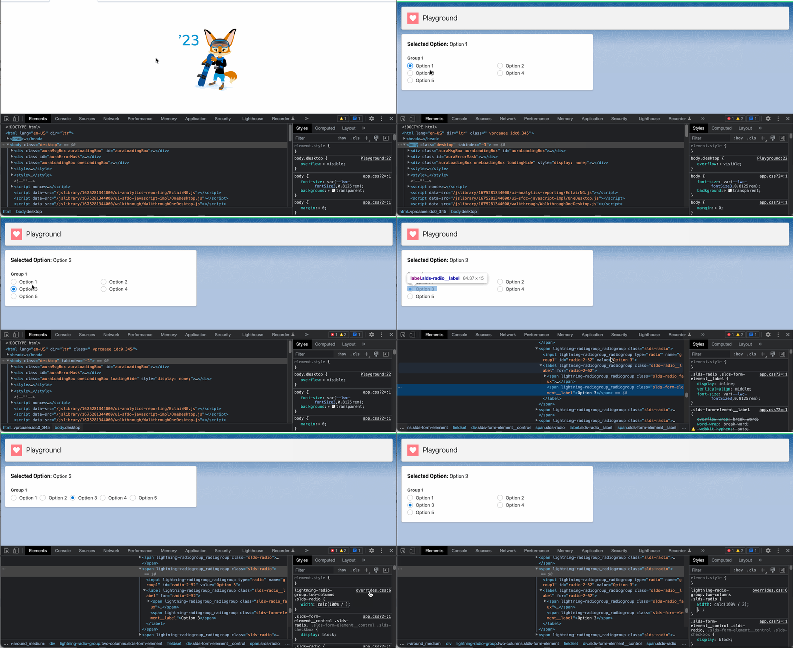
Following our conversation in comments chat of this answer, we came to trying the approach of using static resource that contains styling override for the lightning-radio-group component. Instead of dividing the single group into two or more and maintaining duplicate code, we can use a single group but divide it into 2 columns using styling overrides. Static resource is used because LWC doesn't support inheritance of parent's LWC styling because of the shadow dom. There are some tricks with slot but not in our case since it's a standard component.

How to create static resource using sfdx

If you will make changes to your static resource's styling, don't forget to do hard reload of the page, because the old css will be cached and you won't see new changes.

Update your component with this code:

html

<template>
    <div class="slds-card slds-p-around_medium">
        <lightning-spinner if:true={isLoading} size="medium" variant="brand" alternative-text="Loading">
        </lightning-spinner>
        <div class="slds-p-bottom_medium">
            <span class="slds-text-title_bold">Selected Option:</span> {selectedOption}
        </div>
        <div if:false={isLoading}>
            <lightning-radio-group class="two-columns" name="group1" label="Group 1"
                options={options} onchange={handleChange} type="radio">
            </lightning-radio-group>
        </div>
    </div>
</template>

js

also added spinner to show while css is being loaded to not show user how elements jump all over the screen during rendering

how to load styling from css

import { LightningElement } from "lwc";
import { loadStyle } from "lightning/platformResourceLoader";

import CustomStyling from "@salesforce/resourceUrl/CustomStyling";

export default class TwoColumnsRadioButtons extends LightningElement {
  isLoading = true;
  selectedOption = "None";

  connectedCallback() {
    Promise.all([loadStyle(this, CustomStyling + "/overrides.css")]).then(
      () => {
        this.isLoading = false;
      }
    );
  }

  get options() {
    return [
      { label: "Option 1", value: "Option 1" },
      { label: "Option 2", value: "Option 2" },
      { label: "Option 3", value: "Option 3" },
      { label: "Option 4", value: "Option 4" },
      { label: "Option 5", value: "Option 5" }
    ];
  }

  handleChange(event) {
    try {
      this.selectedOption = event.detail.value;
    } catch (error) {
      console.error(error);
    }
  }
}

staticresource/override.css

I added the two-columns class to apply the overrides only for certain elements and not all radio button groups, since this css file will be loaded for the whole page.

lightning-radio-group.two-columns .slds-form-element__control {
    display: flex;
    flex-wrap: wrap;
}

lightning-radio-group.two-columns .slds-radio {
    width: calc(100% / 2); /* divide by the number of columns you want to see */
}

Updated demo and how calc(100% / 2) works Styling demo
9
  • Thank you for your response. I tried out these examples and from a UI perspective, the grid solution works better for my use-case and looks good there. The only issue that is deterring me is that when I click on any of the radio buttons in Group 2 (options2) . In your demo (option 3 and 4), it doesn't click completely into it. The outside of the circle is highlighted but i have to click into the radio button twice to actually select it. Do you know how that can be resolved? Commented Feb 3, 2023 at 16:11
  • Can you update the answer with a screenshot how it looks? Because in my org everything works and clicks without any issues Commented Feb 3, 2023 at 16:20
  • I wasn't able to edit my prior answer but i did add a screenshot in my original question of the highlightning of the radio button i'm talking about. I did more debugging and the code as it is (without the onChange javascription working) is what works fine so explains why in your org it's fine. However, my JS function for handleOption is what is causing the issue. I wonder if it's an issue that i'm pointing to the same onChange Function for both radiogroups.. Also my apologies, I didn't add all the relevant JS including the onChange function in the JS. I updated that as well in my question Commented Feb 3, 2023 at 16:47
  • 1
    try to wrap the inner code from the handleOptions() function in try-catch block, maybe there is an exception that causes the issue. Commented Feb 3, 2023 at 16:52
  • 1
    THANK YOU!!!! this works for me now! Commented Feb 3, 2023 at 23:48

You must log in to answer this question.

Not the answer you're looking for? Browse other questions tagged .