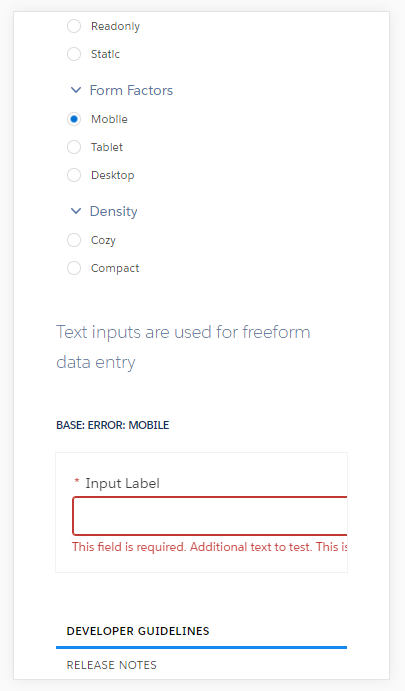
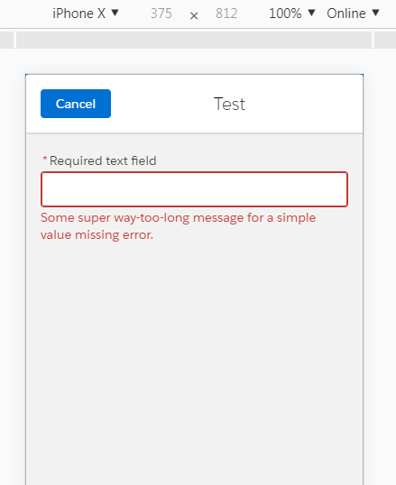
I am using lightning:input out of the box component. I'm displaying an error message on the field using the standard functionality of the component. The error message is little long for Mobile but instead of wrapping to next line it overflows. I went to check for the styles in Lightning Design System and viewed that page on Mobile using Chrome Developer Tools. Seems like there is bug in the styles because it is doing the same what I'm experiencing in my component. I tried to override the styles but it is not working. Anyone knows how to solve this? Thanks for your help.
1 Answer
Maybe, it's the emulator, but it seems to work out of the box.
Chrome - iPhone X, Pixel 2, Galaxy 5s.
Well, I just tried it on my Android SF1, and it worked as well.
<aura:component description="tempComponent" implements="flexipage:availableForAllPageTypes">
    <lightning:input name="input6" required="true" label="Required text field" messageWhenValueMissing="Some super way-too-long message for a simple value missing error."/>
</aura:component>


