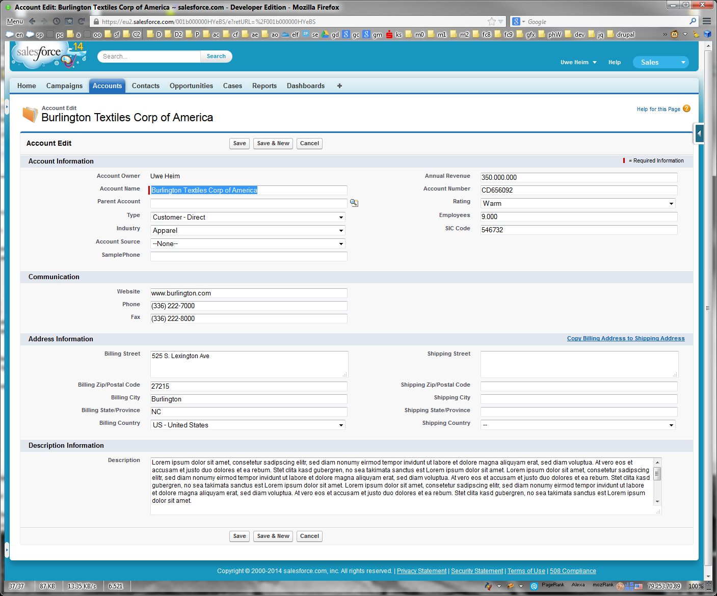
What you are doing very localy with the style attribute could also be done by settings in a CSS file or in a style tag for all the input, select and textarea controls.
The stanard CSS setting the width of input fields is in my experience one of the most disappointing design flaws of the Aloha UI. Not only the different sizes look ugly but the waste of screen real estate and a way to smal width lead to a very poor usability.
At the same time it's very easy to improve it by setting the width to a % value close to 100%. The 85% you have choosen make some things easier for markup composites like lookups and in inlineedit mode.
With some more effort in CSS fixing you can reach a 100% fluid design for nearly everything, including inlineedit mode


Some more thoughts on this here Why do we still need to hack the Sidebar? Usecases - Workarounds - Alternatives
In another project I made even the multiselect picklist 100% fluid. Was a bit harder but users love it.
Mind that salesforce doesn't support this kind of CSS hacks and it might break in future versions of salesforce.


