0

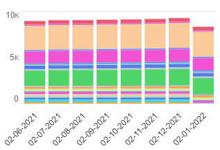
Even though the report also contains data for February and March, these months are not displayed in the Dashboard (European dates are used):

enter image description here

The fact that the bar for January 2022 is shorter than that of December 2021 is also an indication that some kind of cut-off is encountered.

I tried using the graph from the report directly in the dashboard and I tried a graph constructed in the Dashboard, but both suffer from the same problem. If you view the graph in the underlying report, the bar chart shows all data.

So the configurations that I tried:

  1. Use chart settings from report
  2. Stacked Vertical Bar Chart: x: CreatedDate, y: Sum of number of Prospects, Stack by Country, Sort by CreatedDate, Then sort by Country, Max Groups displayed: 100

Refreshing the dashboard is not the solution.

The report tells me that it contains 1,277 records. Could it be that dashboard graphs can only display data for 1,000 records?

I am wondering if I am running into the limit mentioned here:

In dashboard components, line and bar charts display up to 1,000 groups.

2
  • It would be helpful to include the dashboard config for this chart vs report config in your question.
    – identigral
    Commented Mar 24, 2022 at 16:55
  • @identigral I added the two configurations. Commented Mar 28, 2022 at 7:19

1 Answer 1

0

After looking very carefully at the graph (enlarging it in vertical dimension) and totalling the number of displayed records in the complete bars, I was able to find out how much and which data was missing from the right most bar. And it turns out that what Salesforce calls "groups" is what I would call "records". Anyway, the limit that I mentioned in the question is the culprit.

My workaround is:

  1. Not to use the report graph in the dashboard.
  2. Reconstruct the report graph in the dashboard, but without the vertical grouping inside the bars.

This way users get an overall impression and if they want a more detailed view, they just need to click through to the report, which features the graph with a complete grouping.

1
  • Just to add to this; it was actually the number of groups; not records. I had a report grouped by month, location, and customer. Since I had over 1,000 customers, I was running into the limit. I made the customer a detail column, and only kept month/location, and now all months are showing. Hope this helps! Commented Jan 20 at 8:03

You must log in to answer this question.

Not the answer you're looking for? Browse other questions tagged .